
Enhancing Trust and Increasing Health
Peak Health and Performance was a brand new business when they came to Projech. The owners, Kate and Evan Durnin, recognized that they would need a strong brand that reflected the vision and the passion they had for the clinic in order for their business to grow.
Solution
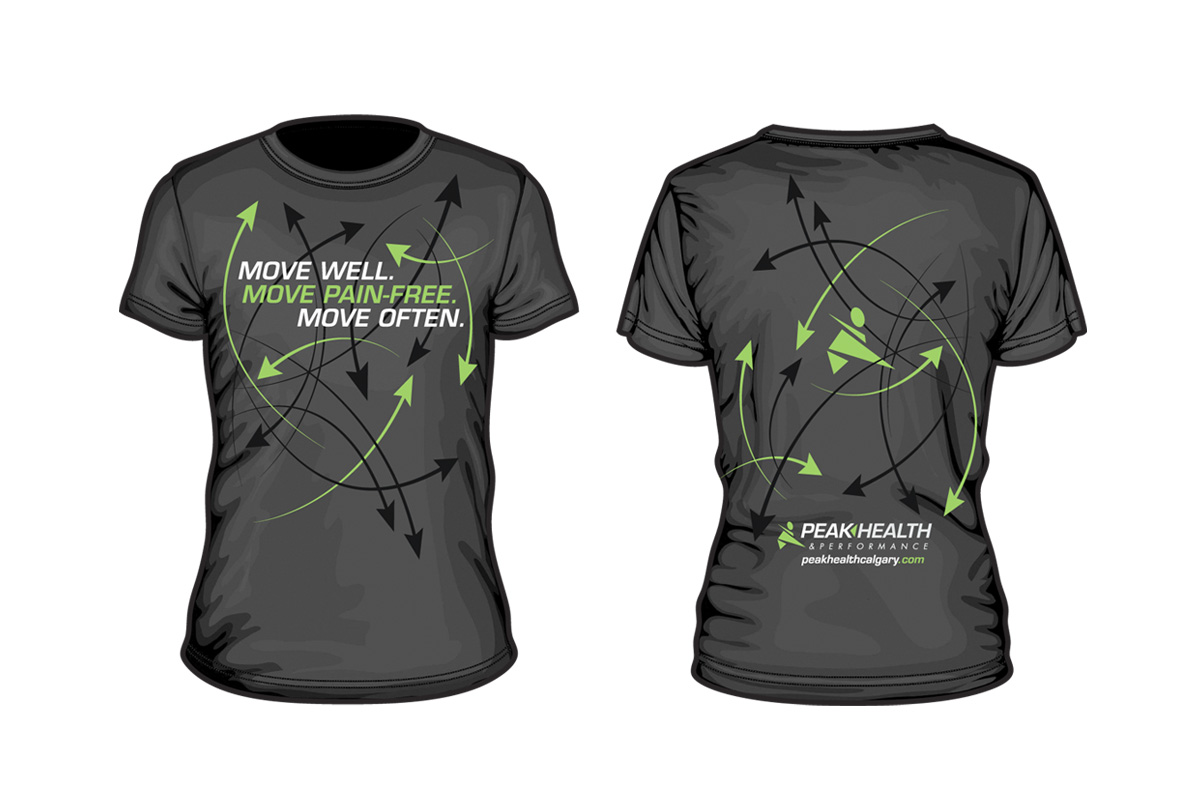
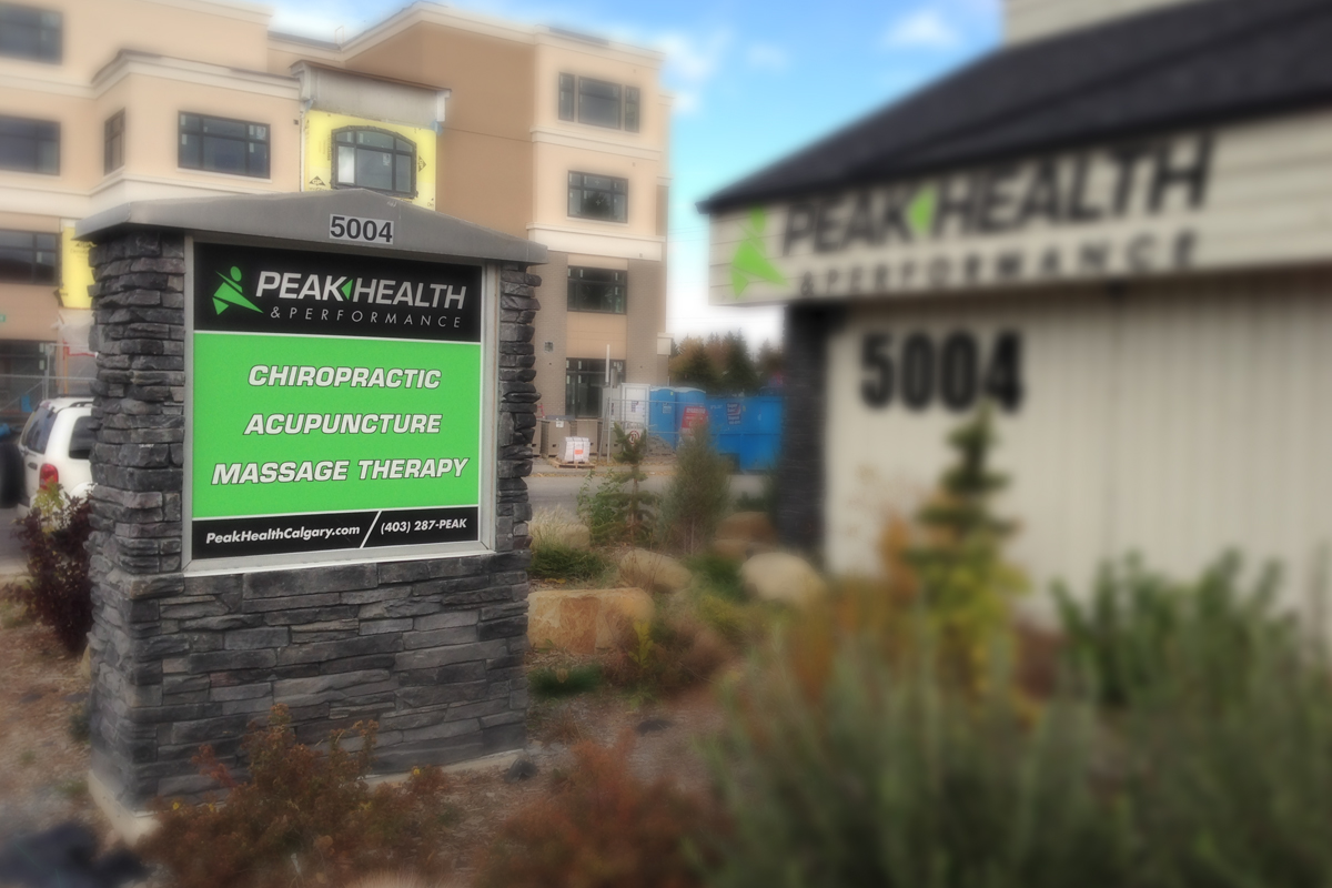
As Peak Health helps their clients progress and move forward in their life through rehabilitation, Projech came up with a visual identity that would communicate this. Using forward facing angles and a bold italic font, the image creates a sense of forward progression. The colour, bright green, establishes the sense of energy, healing, and positivity that Peak Health creates in their clients. The sports icon, initially hand drawn, was inspired by the images you would see on the walls of sports arenas and gyms, again speaking to the health, healing, and energy that Peak Health gives back to their clients.
Next Step
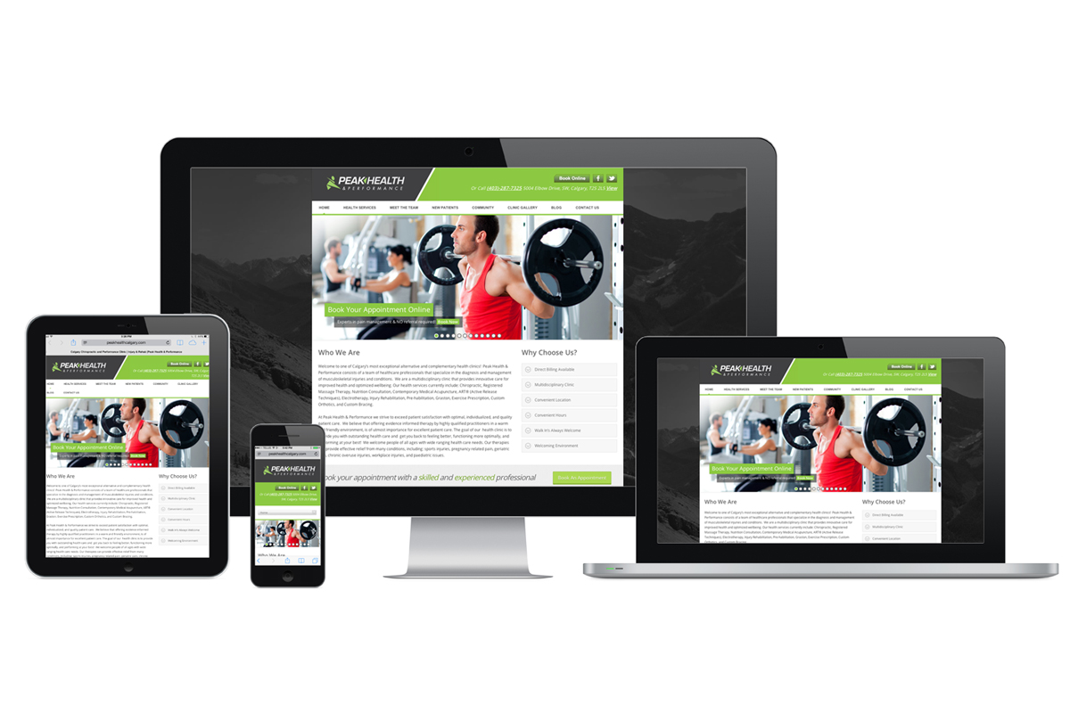
Using the same underlying themes of steady progression and positive energy, Projech then developed Peak Health’s website. With this forward visual feel, Projech developed the site so the reader’s eye would flow to strategically placed “Book Now” buttons. This makes it extremely easy for the reader to know how to make an appointment and begin working with Peak Health.
Result
Peak Health continues to work with Projech on a number of marketing projects because of the positive feedback they’ve received from their clients, friends, and colleagues. They’ve noted that even their competition has tried to copy their website! Evan has said that a large reason why Peak Health has become so successful is due to the branding work that Projech created. Projech took the time to understand Peak Health’s clients, what Peak Health actually does for their clients, and then develop a brand that inspires trust in their Peak Health.